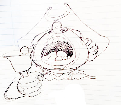
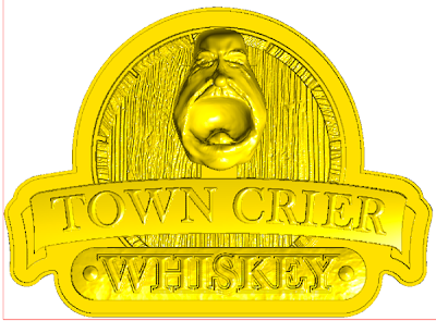
We needed one more sign for a key area in the Fox and Hounds Pub. The sign wouldn’t be large, measuring about 30 inches tall at most but it needed to shout out. We toyed with a multitude of ideas and I filled my sketchbook with ideas but nothing clicked. The owner of the pub had asked for a sign that featured whiskey and was very British. Yesterday I typed pub signs into google, looking for inspiration. I didn’t see anything I liked but I did get an idea. Town criers dated back to the 1500’s. I did a quick sketch and knew this was the perfect idea.
The idea I had scribbled needed a lot of work. Then I remembered a drawing I had done more than twenty years ago. It had been sitting on my bulletin board just waiting for it’s day to shine.
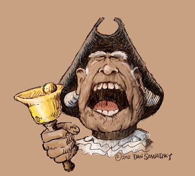
I pulled it into PhotoShop and cut, pasted, morphed, stretched and tweaked until I had what I wanted. I then redrew the town crier adding a hand with a bell, a tricorne hat, a powdered wig and a ruffled shirt. It made me laugh while I covered my ears. This guy is obviously LOUD!
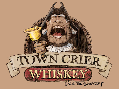
Then I added a scroll with town crier and panel underneath. A whiskey barrel head for a background finished the story and tied it into the Pub decor nicely. The colors will also mirror everything else we have done to date.
Then it was time to start in on the sign design. I created the basic vectors in Illustrator then Imported them to EnRoute.
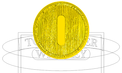
I opened a barrel I had created for Big Ben the horse as it would save me building this part again. I changed it from an oval to a circle to fit this design.
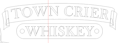
Using the basic layout I created half of the banner using the drawing tools. I then copied and flipped it for the other half before merging them together. The guild lines were then deleted.
Then I built one end of the scroll, copied, pasted and flipped that for the other end. I stretched out the bottom panel and added a couple of buttons.
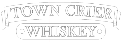
The lettering file I chose was good but a little thin for routing. The cure was easy. I simply added a thin outline and then deleted the original lettering making things a little bolder. I often do this with thin fonts.
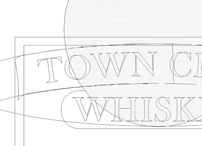
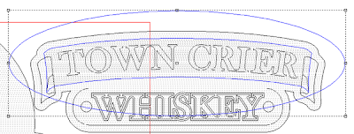
I wanted the banner to bow up a little so I drew an oval around it and by selecting the banner relief and the oval I modified the banner relief using the dome command.
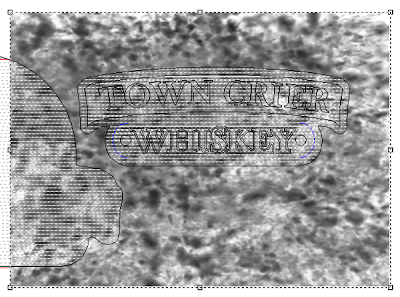
Then I added a texture to the whiskey panel using the ‘splotches’ bitmap from my TEXTURE MAGIC collection.
I added the prismatic lettering and then combined all the relief into one file, ready for routing.
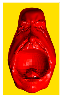
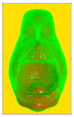
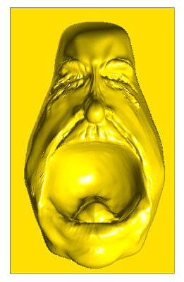
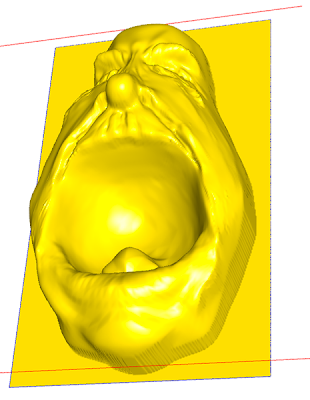
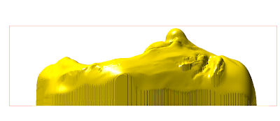
For the face I created a rough sculpture in Mudbox – a freehand sculpting program. It exports an .obj mesh file. I converted this to a .stl file in another program and then imported this into EnRoute. I sized, rotated and positioned the mesh and then created a zero height relief to which I would merge it
Both re selected and then the button that allows me to merge the mesh and the relief lit up. I merged highest to make them one. The mesh could then be taken away.
The head will be routed as a separate piece out of a 3″ block of 30 lb Precision Board. I’ll be using this rough form to use an an armature for the sculpting with Abracadabra Sculpt that will follow.
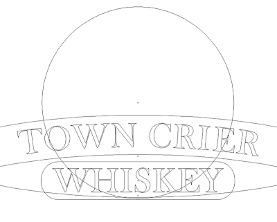
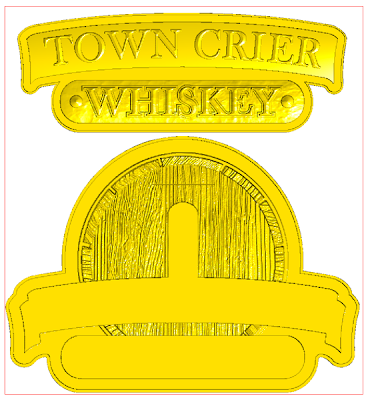
To make sure everything was sized right I brought all the pieces together and positioned them as they would be glued after routing. Here’s how that looked.
Now it is on to the MultiCam. Stay tuned…
-dan
Published with permission from precisionboard.blogspot.com. Source.
