With the next Sign magic Workshop now only a week away we are very busy creating the name plaques we give each attendee. For the first one I wanted to create the look of an old piece of news paper with Darrel’s name on it. The font I used was called American typewriter.
To get an antique look I decided I would give a new tool in EnRoute 5 a try. The tool is called noise distortion. It is found in the transform group, under the subheading of distort. Since it is a new tool to me I had to noodle around a bit to figure out, first how it work, and secondly how to get what I wanted for this file. The preview function proved to be real handy!
Once I had the look I wanted I deleted the original letter vectors. This was looking old and well worn already – and with just the click of a button instead of having to hand draw the wiggly lines as I have always done.
I used the offset tool to create a border around the letters.
I drew up a rectangle with rounded corners, then used the noise distortion tool once more to create the decal edge of the news paper. Once again it was with the click of a button rather than hand drawing it. This distortion tool is cool!
I enlarged the rectangle to form a backer board for the name plaque.
Then I used the point edit tool to quickly grab a few of the nodes to drag them in and form some rips and cracks in the edges of the news paper. It only took a few seconds.
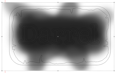
I snapped a screen shot of the vectors and then opened the file in EnRoute. I would use this outline to produce a quick bitmap that I would use to shape the newspaper. I used a big fuzzy brush with the opacity dropped down to about 50%. I didn’t spend more than a minute or two on the task. As I drew I kept in mind that black does nothing, white will raise up areas and grays do in-between , depending on their relative value. Looking at my bitmap I see that the edges will raise up with a couple of folds while the middle will drop down.
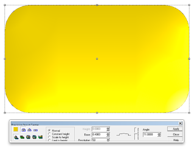
Then it was time to start in on the reliefs. I used the dome tool initially to create my plaque base.
Then I grabbed my tool outline and used this vector as a mask to modify the original relief.
I then imported the bitmap I had created and applied it to the relief. In the screen capture below the name and outline is selected as well as the plate and newspaper outline. It shouldn’t be selected so if you are repeating this exercise make sure you don’t do as in the picture.
To add a bit of a hump in the middle of the newspaper I applied a second bitmap. By understanding how the various shapes of white, gray and black affect the relief we can purposely create any effect we want.
To make the newspaper look just a little older I used my faithful SPLOTCHES bitmap using a small value to add some wrinkles to the paper.
The completed paper relief looked like this.
Then it was back to the letter vectors to modify the relief by adding the letter outline first.
The last step was td add the slightly domed letters.
I’ll tweak it slightly with the die grinder as we prepare for paint but it isn’t going to take more than ten seconds for what I want.
This new distortion tool works pretty cool. It is but one of the many new features in EnRoute 5 that will save me a bunch of work!
-dan
Published with permission from precisionboard.blogspot.com. Source.


