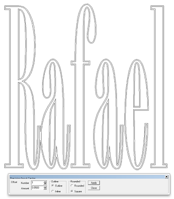
Rafael is our guest teacher from EnRoute for the Sign Magic Workshop that begins tomorrow. He is one of the support techs for the software and knows his stuff. He has attended our workshops previously. For his name I selected a narrow font. The kerning was a little weird and the letters were narrow but we’ll take care of that in a jiffy.
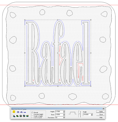
To remedy the narrow lettering I simply did a narrow (0.05″) outline. My first try showed the ‘R’ and the ‘a’ a little too close together so I backed up a step, jogged the ‘R’ away and then repeated this step.
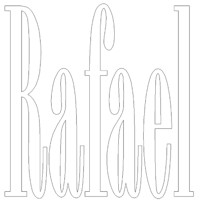
Then I deleted the original letter vectors.
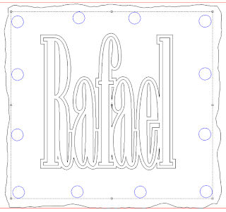
I used the offset tool once again but this time with a 0.2″ offset to crete the letter outlines.
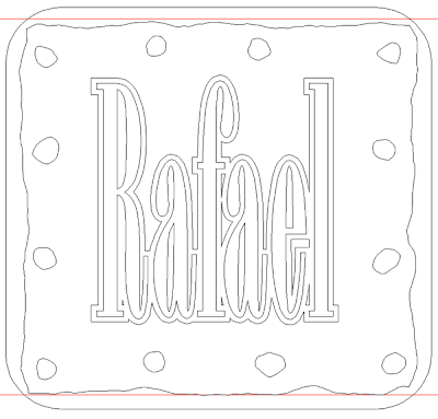
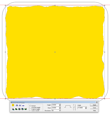
Then I used the distort tool to modify the plaque border. I’m starting to get the hang of this tool and i like it!
Once I had the online nailed it was time to add some rivets. I started with some circles.
I then used the distort tool to rough up the rivets suitably – like the plaque border.
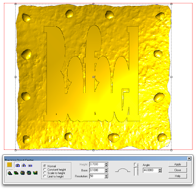
With the vectors done it was time to start in on creating the relief. A flat relief was the first step.
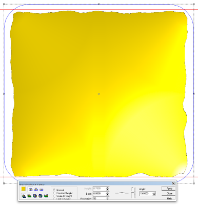
I decided to dome up the plaque a little so I drew a square with rounded corners around my relief. By selecting this vector AND the relief, the relief would be modified to the shape of the rectangle vector.
Next I create a separate flat relief of the lettering outline.
The lettering relief was also shaped with the same rectangle vector as the base relief had been with the same parameters entered. Doing so meant the the base relief and the lettering outline relief were the same shape.
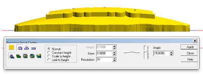
After I had domed the two pieces I checked the front view to make sure everything worked as I wanted. The two reliefs were separate so I was not worried about their height in relation to each other.
Next up was the texture. I called up my old standby ‘splotches’.
Once the texture was on it was time to put things into position vertically. I did this in the front view using the up – down arrow keys.
When I was happy I merged highest and then deleted the lettering outline relief.
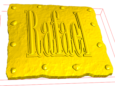
The last step was the lettering. I opted for a beveled lettering, nice and clean to counter the rusty texture below.
As quick as that another Sign magic Workshop name plaque was ready to tool path and send off to the MultiCam. As always it would be routed from 1.5″ thick 30 lb Precision Board.
-dan
Published with permission from precisionboard.blogspot.com. Source.

