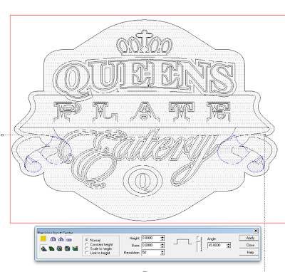
With the background of the sign done it was time to start in on the scroll and lettering. While I could have made the scroll all curved the reality was there would only be 0.15″ between the layers on the folds… not much room for anything fancy. Dave was more than capable of doing fancy blends with paint to make the sign more dimensional. The scroll pieces would all be built as separate elements one layer at a time and then merged highest with the background at the end. I started by selecting the lowest elements of the scroll and made them 0.8″ tall.
Then I worked my way forward keeping in mind what folded over what. There were four layers over all.
In these front views we can see the layers of the scroll stacked up.
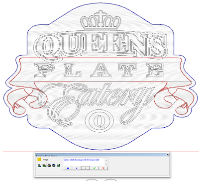
Then, when I was satisfied how everything lined up it was time to merge the layers to the sign. First, after opening the merge menu, I selected the background relief.
Now it was time to move on to the eatery lettering. This needed some special attention to make it work. I kept Dave’s original rendered view handy for reference and noted that the end bits of the lettering on each side tucked under the scroll. But the scroll ends were lower than the shield in the center of the sign. This meant the Eatery lettering had to bend upwards. EnRoute is capable of just such a feat by using a special procedure.
To accomplish this task I drew an oval around the work eatery. We would use this to modify the relief later.
First I created a flat relief that was 0.45″ tall. This number was a bit of an educated guess on my part as to the height but it worked out in the end.
Once I had the flat relief I then modified he relief by selecting both it and the oval vector I had created previously. A 12 degree slope on the curve also proved to be the magic number in clearing the center shield and sloping down enough on the edges to tuck under the scroll folds. It took me three tries to figure this out. Once I had the lettering background right I added the lettering to this relief.by raising it 0.15″ (not shown)
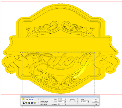
Then, after checking everything in a couple of different views I could merge highest to the background relief.
The sign relief was coming along nicely and showed some great looking dimension.


