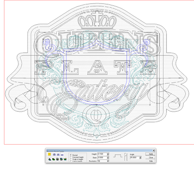
The pub sign started like pretty much every project. I would build a flat relief, in this case 0.4″ thick. Everything else would be built on top or added to this basic relief.
The next step was the borders. These vectors were selected along with the original relief and then I modified the original relief by adding to them 0.15″ in height.
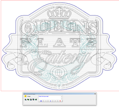
The ornate background border was next. It overlapped the border element so I built it as a separate relief. Because so many of the elements overlapped from here on in, we would have to build the rest of the files and separate reliefs and then merge highest to modify the original relief. I first built the fancy design as a separate relief that was 0.7″ tall to make it slightly higher than the background and borders. Then I modified this relief by adding the shield shape that was another 0.15″ tall.
this fancy shape was then merged highest with the base relief. The two steps for this proceedure are shown below.
And here’s the file rendered as it now looks.
So far things have been pretty easy and straight forward but as we get into the file it gets a little more complex. Stay tuned for more next time.
-dan
Published with permission from precisionboard.blogspot.com. Source.


