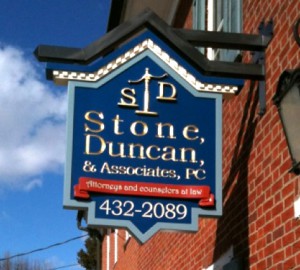
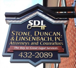
Some might argue that a sign is merely that, a sign, but here at Coastal Enterprises we know that’s not true – many signs are works of art. In that sense, we would like to congratulate Facebook contest winner Wray Bassett on his artistic creation. Wray is the owner of Graphic ID located in Dover, PA and won Best Design in our contest.
Wray got his start in the visual communications industry in high school when he became interested in hand lettering while living in New Jersey. After several years as a military dog handler in the Air Force, Wray attended New Mexico Highlands University and received a Bachelor of Fine Arts degree in visual communication.
Graduation brought on a job as an illustrator in Pennsylvania, but a love for dimensional graphics led Wray to start Graphic ID as a side job in 2001. With help from his trusty shop dog Baxter, Wray has been full time owner of Graphic ID since 2008. They are a full-service visual branding firm and offer complete logo design and branding solutions.
Wray’s award-winning sign was designed for a law firm to match its 209-year-old building and surrounding area. It was made to replace a sign that Graphic ID made less that one year earlier. The addition of the firm’s third partner and subsequent rebranding initiated the rebuild. Because Wray documented the build process of the original sign so well, and since it is very similar, we decided to showcase both in our newsletter.
The sign face was CNC routed from Precision Board Plus PBLT-18. An internal armature was fabricated from 1″ square steel tubing mounted in a hand routed channel between each sign face to provide extra strength. PB Bond-240 urethane adhesive was applied to secure the bracket in place and laminate the sign faces back to back .
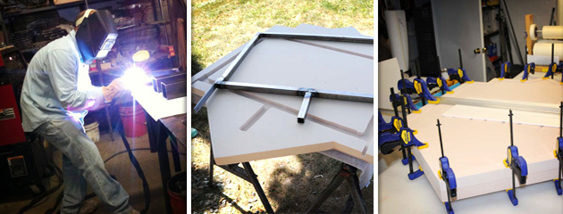
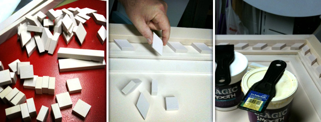
Wray cut the dentil molding and ribbon using a band saw, table saw and hand tools. The parts were then adhered using Abracadabra Magic Smooth two-part epoxy. Magic Smooth can be used as a texture coating but also makes a great adhesive. He then primed the sign with FSC-88WB Primer/Filler and finished with Matthews paint. 23k Gold Leaf was used to provide some eye-catching lettering and he welded 3″ box steel to make a sharp looking bracket to hang the sign.
The original sign had a Scales of Justice logo, which is not present on the contest winning sign. The original logo was hand made from HDU and Abracadabra Magic Sculpt. By creating a silicone rubber mold of the logo and pouring in Smooth-On Smooth-Cast 300 liquid plastic, the Scales of Justice were easily duplicated for both sides. These were also finished with Gold Leaf.
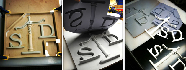
Although only built less than a year apart, the methods used to fabricate the signs varied between the two signs. Wray says the thing that won’t change in the future is his trust and use of Coastal’s Precision Board Plus and their companion products.
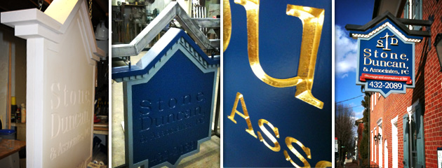

Be sure to check out Graphic ID’s website at: http://www.graphicidstudios.com.
Facts about both signs:
- The original sign was cut using mainly hand tools, only the face was cut with a CNC router.
- The new sign was cut almost entirely by CNC router and ended up saving Wray hours of labor time.
