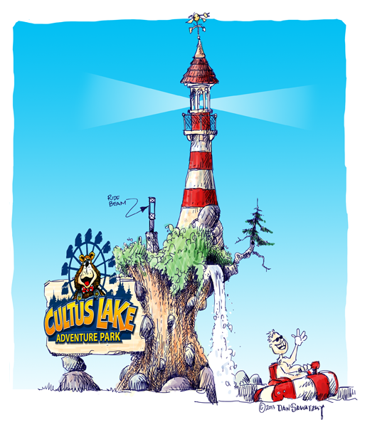
I started design for this project about four months ago. The sign was to be a teeny part of a very large project – an entire theme park. My client approved the design of the sign holder (the waterfall, wood base, small mountain and the lighthouse but wanted a rethink of the actual logo. His fear was that it was too childlike and not appealing enough to a broader and age varied demographic. He asked that we drop the ferris wheel and bear and revert to just the lettering.
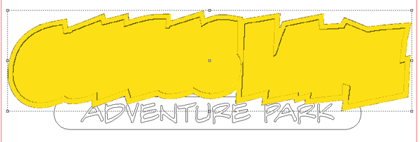
While we were at it I wanted to revisit the whole look of the logo. My concern was that my client loves to use big bill boards with photo backgrounds. These often are very busy. That meant the logo had to read well no matter where it was used. Wide, layered borders around the primary lettering and a plain banner with the words adventure park were the answer. My client agreed. Now at lst the sign is ready for routing.
This project was super simple, as it is just a whole bunch of layers. Rather than build them separately I like to whittle everything from one block. There is no failure of delimitation or lettering falling off that way. I selected the outermost letting outline and created a flat relief 0.5″ tall.
Then I modified the relief by adding another layer using the next inner border. This was raised 0.3″.
The next border was then added in the same fashion.
And then it was time to add the lettering, this time at 0.4″ high. The inside of the letters was then lowered by using the subtract function at 0.2″.
Then I built the banner below as a separate relief 1.3″ tall. The two reliefs were then selected and by using the combine function (MERGE) they were made into one.
Lastly I modified the base relief using the lettering vectors. I uses the dome tool to create slightly rounded letters. As quick as that the file was ready for tool pathing.
Next time I’ll show how we build the files to accommodate the secure mounting hardware. Stay tuned…
-dan


