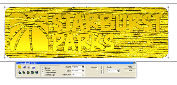
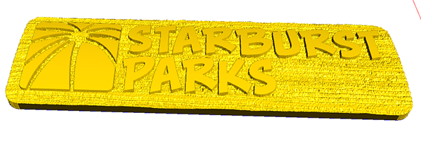
Corporate signs are something we do very seldom. They present little opportunity to be truly creative. But every once in a while we need to build such a sign. Our theme park project, Skallywag Bay Adventure Park in Trinidad is owned by a second company, Starburst Parks. I developed the logos for both companies. Skallywag Bay needed to be full on creative and will feature a full blown 3D sculpture of a marvelous pirate ship. It will be a fun project that requires all of our skills. The small sign for the corporate headquarters door needs to be low key and well… corporate. Today I designed the routing file for that business entity. It will be routed small enough to fit into my suitcase on my next trip to Trinidad as a present to my client and generous host when I am visiting.
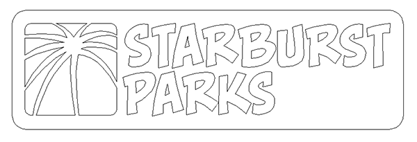
The logo was designed in Illustrator. It represents a fireworks starburst and also a palm tree. The logo as presented on the letterhead and corporate stationary will be in red and white.
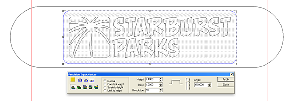
As always the routing file creation starts with the vectors, in this case already complete. I imported then into EnRoute and added the background border.
I then added a sausage shaped vector around the original vector. I would use this vector shape to modify the relief as I built the file.
I first created a flat relief using the plaque border.
I then modified the flat relief using the sausage shape using the dome tool.
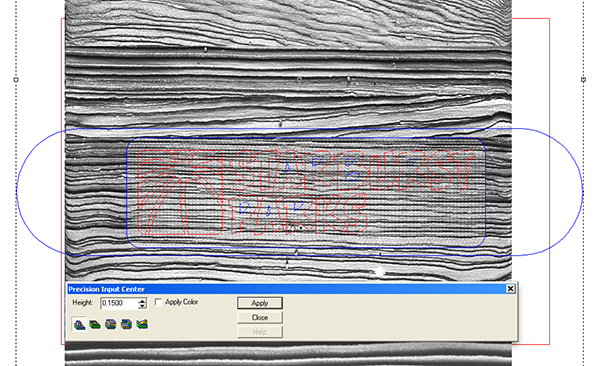
I then imported my woodgrain bitmap texture. It opened by default to be the height of the plate.
I stretched it out so my relief was under the woodgrain that best suited this piece. The woodgrain bitmap was applied with a value of 0.15 inch. I used the lettering and logo image as a mask. Because I wanted the woodgrain on the plaque and not in the letter areas I also selected that sausage vector shape. This revered where the woodgrain would go on the relief.
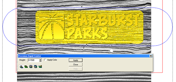
The last step was to raise the lettering and image which I did by modifying the original relief and the add tool.
As simple as that the routing file for the small sign was complete. It’s not super fancy but it is still a sign that will stand out from most corporate identities while still being business like and a little formal. I’ll tool path it and route it from a piece of 1.5″ thick Precision Board very soon and then we
ll paint it up in official corporate colors. I’ll use a darker red glaze to spice it up just a little.
-dan

