As we put together each of our projects I design for three views. Long shots, medium views and closeups. In our large current project we were able to do it for every element (and there are many) of the park.
The long shot of the setting needs to grab people’s attention and hold their interest. The entire scene is carefully composed to draw visitors in. Background clutter is minimized as much as possible. I try to limit the angles of viewing to the best attainable. This is done by positioning the pathways. As we enter the park this view of the project is evident. The giant steel ride (yet to be installed) is framed by the background trees of the park. In the foreground is the operator’s booth and the horse and wagon which is to be used as a photo opportunity.
As guests approach they see the middle view. The sign is now readable but not the primary point of interest. The operator’s booth perched high on the rock with the stairways is now the focus. In the foreground a stream will tumble between the rocks. The barrel and cactus on each side work like parenthesis to frame the picture. Landscaping will complete the story.
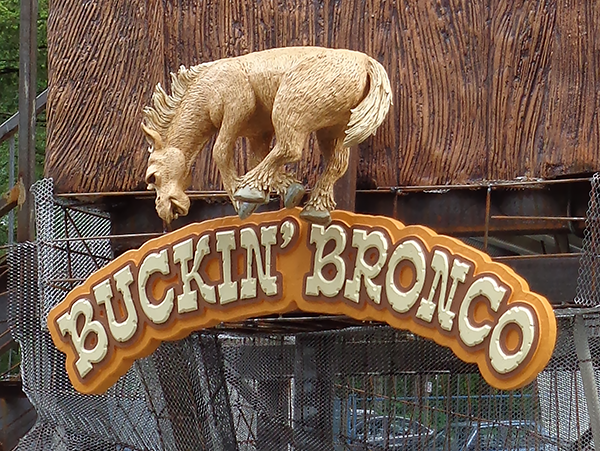
As guests come a little closer they now can easily read the sign. The exquisite detail and character of the dimensional sculpture is now the focus.


