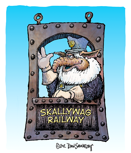
I then added the letting using the same font we are using on some of the other signs in the park. A few of the letters were modified and tweaked to make the sign read better. I also added the rivets around the panel.
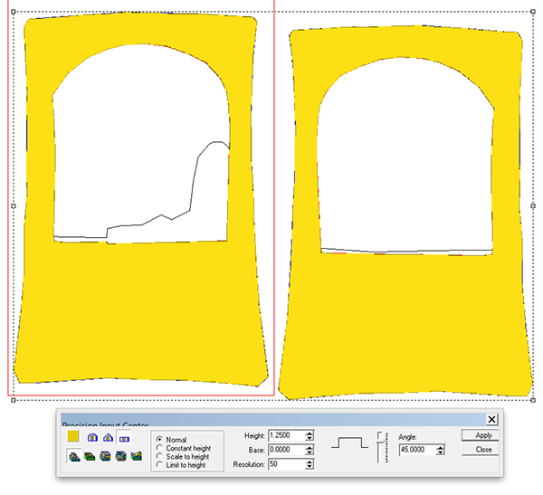
I decided to route the sign in four layers, front and back as well as two layers for the center of the sign. The two center layers would have slots cut in them for the welded step frame. Each layer was also different as they incorporated different layers of the engineer and his arms. The two back layers were flipped so the two halves of the sign fit together. The center sections of the sign looked like this (except one was flipped so they for together and the step could be laminated into the center)
The two outside layers looked like this. On the show side of the sign I included a cutout of the engineer’s arm which will sit on the window ledge.
I built the two sides at the same time, starting with a flat relief.
I then imported a bitmap and used it to modify the reliefs. It created a subtle texture.
I then added the rivets, modifying the base relief by using the dome tool.
The next step was to create the door inserts. I did this by building separate flat reliefs.
I then modified these reliefs by adding a woodgrain texture from my TEXTURE MAGIC bitmap collection.
I then used the replace tool to put this panel into place on the base relief. I could have used the MERGED LOWEST command to get the same result.
To check that things went as planned I looked at the front view. I’ve marked a red arrow to indicate how the panel looks in place.
The lettering outline was the next step, once again building them as separate reliefs.
These were MERGED HIGHEST with the base reliefs.
The bevelled lettering was the next step, achieved by using the ad too command with the bevel tool.
The two window sills and the engineer’s arm were then built as separate reliefs the full thickness of the panels. I then selected the various components (of each panel) and merged them to create a single relief.


