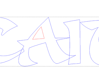
Caitlyn’s name plaque was next up. The typestyle I picked had some pretty sharp and thin ends. If the letters are routed this way the letters become pretty fragile.
The solution is to thicken the tips up. For me the quickest way to do it is to draw new ends and then merge these new shapes with the letter vectors.
Once the thin ends were fixed the font still looked a little stiff. I wanted it to look like it was hand drawn.
I then used the distort transform tool to warp the letters.
Once I was happy with the letters I added the border. At this point I was still thinking of a rectangular name plaque with rounded corners. But as I looked over the vectors I loved the casual script but the formal shape of the plaque no longer worked.
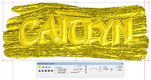
I decided a piece of driftwood would work better. I imported the driftwood bitmap and hand drew the outline. Then I used the dome tool to create a relief.
Once the relief was in place I applied the bitmap.
Then I used the hand sculpting tool to put some grooves in the driftwood.
I then used this oval to modify the flat relief using the dome tool with the same angle on the dome as I used to create the driftwood board background.
I then went into the front view and nudged it into place using the up/down keys.
Once I was happy with the vertical placement it was time to merge highest with the base relief.
The last step was to modify the base relief by adding the bevelled letters.


