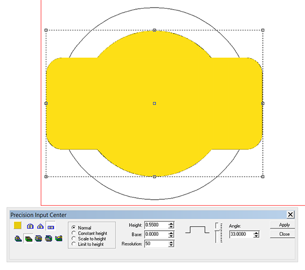
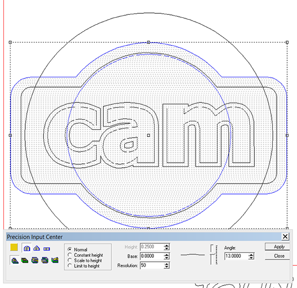
Cam is a returning workshop attendee. Last time I made him a riveted ‘metal’ panel. Cam is an engineer (among many other things) and so I decided to make him something techy this go around. The panel is relatively simple but I used a couple of tricks to add more dimension. I drew the piece entirely in EnRoute. The outside shape is a rectangle and circle combined. I first created a flat relief.
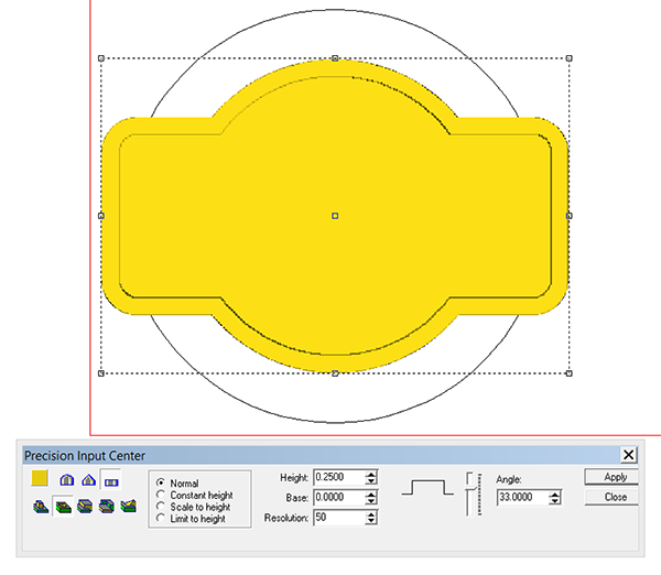
Then I dropped the centre portion using the subtract from command. I dropped it 1/4″ to allow for the texture to be added inside this area.
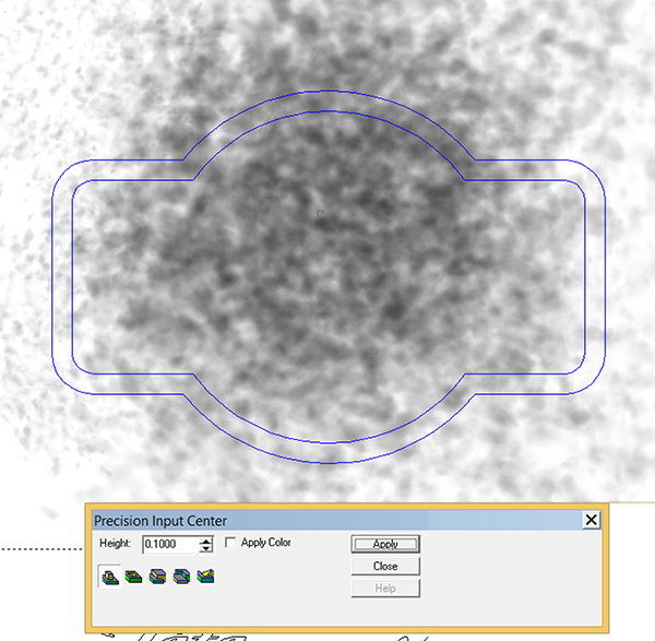
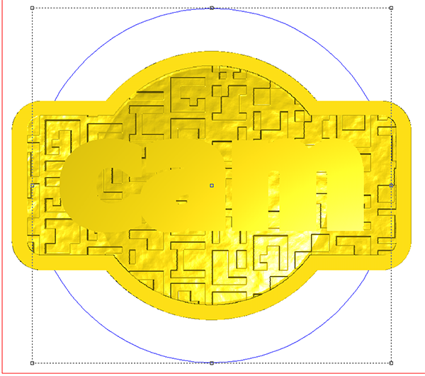
The texture I used provided the tech theme. It is a simple black and white texture. The black areas would stay low while the white would raise up by the .15″ I specified. This meant the top of the texture was still 0.1″ below the border.
I then applied the ‘SPLOTCHES’ texture with a value of 0.1″. This would bring the background up to the border where the image was white and slightly below where it was darker.
I wanted to create a bump in the middle of the panel so I used the circle vector as a mask to define the area to be raised. I used the dome tool but kept things very subtle.
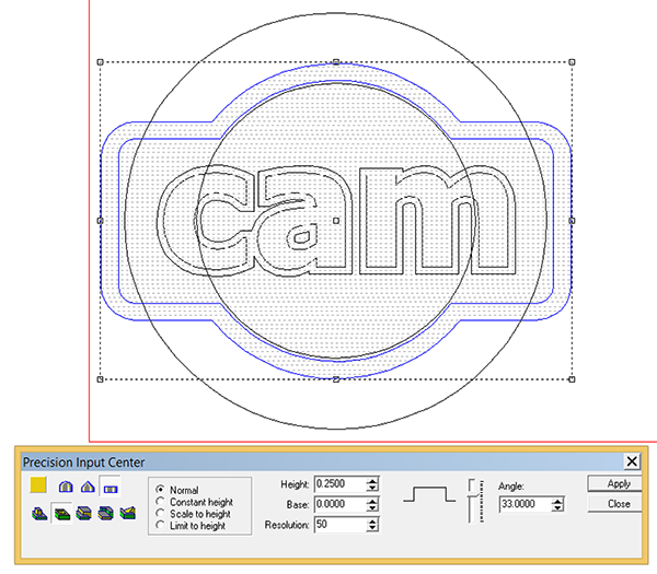
Then it was time to create the lettering border. This would eventually follow that same dome shape of the base relief but first I created a separate flat relief.
Then I used the larger circle to modify this base relief using the dome tool.
Then I went to the front view to check things out. I found that the edges of the lettering outline were touching into the background. It was a simple matter of selecting this lettering outline relief and then nudging it upwards using the up arrow keys on my keyboard.
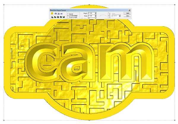
Once I was happy it was time to merge (highest) the lettering outline with the base relief.
The last step was to modify the relief by adding the bevelled letters. I used the constant height function to better manage the areas where the bevels came together.

