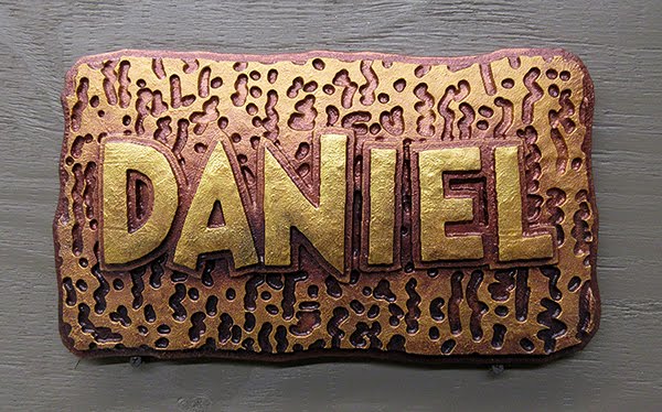
It’s fun to design dimensional signs in EnRoute and pure magic to watch the MultiCam carve the sign unaided from Precision Board. The result looks pretty good. But that is really only half the way there.
The real magic is in the painting process. The first step is to introduce some mild texture where it’s smooth. This subtle texture is created by brushing on some heavy bodies primer. The best I’ve ever found is Coastal Enterprise’s FSC 88 – WB (the WB stands for water based. It comes out of the can the thickness of cream. It dries quickly and if you use a small brush and leave the brush marks in on purpose it dries with that same look.
Then come three coats of acrylic paint. We use a top quality house paint… or in the case of this plaque a gold metallic made by Modern Masters. Three coats are important if you want the piece to last.
Then comes a series of glazes. We always work from light to dark.
For them to work properly you need texture and the more the better. We load on the glaze and then wipe it off before it dries. The glaze stays in the lower areas and wipes off the raised areas. For wiping we use soft terry towel material. It’s the best and we go through pickup loads of rags each year. (We buy used towels at the thrift store.)
The first glaze on the Daniel plaque was made by mixing some gold with a teeny bit of metallic cherry and mixing this paint with an equal amount of clear. For the clear we use untainted deep base paint of the same brand. To make the custom mix deeper colours the paint stores start with a clear base. It looks milky in the can but dries clear. The paint store folks will look at you weird but this is what we buy to make our glazes.
The next glaze was made from black cherry. Like the previous glaze it was slopped on with a big brush and then wiped off with a towel. If you look close you can see a little more dark glaze was left in the middle of the panel to make the letters pop.
The panel was allowed to dry overnight and then some metallic gold was brushed onto the letters. When this was dry a little darker color was gingerly dry brushed onto the bottom of the letters to give them a little extra depth.


