To be fair, I was at least doing it wrong-ish for many years, or at least, not as right as I could be. Allow me to explain – and yes, I’m dusting off this blog after many years of inactivity. I figured I would get things going again by going back to the very beginning, and pass along some of my updated thinking as it pertains to drawing airfoils in NURBS. In case you haven’t read it, here is my original post on drawing airfoils in NURBS. While I feel that was an improvement over how people approached drawing airfoils in the past, in time I’ve found better and more efficient ways of drawing them. By “better” I mean smoother, and more conducive to modeling the things that ATTACH themselves to wings – namely wing tips and wing/body fairings. The method described in that post is the best approach for doing airfoils – IF you are using T-Splines, which I was at the time. I don’t use T-Splines anymore for my work, and so what I found is that there are better ways of drawing airfoils, when you do NOT have the constraint placed upon you that the whole thing shall be one degree 3 curve. The purpose of this post is not to be Rhino3D step by step – in fact this is probably not a great post for beginners – rather this is aimed at folks who already have a decent grasp of NURBS modeling. To a great extent the information in this post is platform agnostic- any NURBS modeling package where you can easily control point count and degree of your curves will work. So, without further ado……
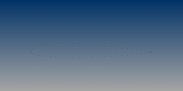
These are the raw points for a NACA 23012 airfoil. I chose it simply because it’s still in use today on lots of aircraft – namely lots of Cessna business jets. Now, people think that airfoils are complicated, but really they are quite simple. They are the addition of two mathematical curves – a camber deflection, and a thickness distribution. Allow me to explain graphically.
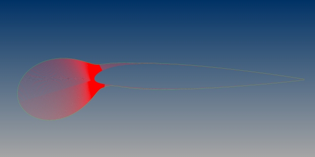
Airfoil ordinate files have top and bottom sets of points. Connect those points with a straight line, and then run a smooth curve though the mid points of those lines, and you have the camber line for the airfoil. So, that’s your camber deflection. Somewhere there exists a formula for the thickness distribution for the airfoil – that is what determines how far from the camber line each set of points is. So, you have a thickness distribution, deflected along a camber line. Simple. Right? NOW! Here’s where I’m going to make perhaps the most important point of this post. YOU ARE NOT LOOKING AT “THE AIRFOIL.” YOU ARE LOOKING AT A DUMBED DOWN COPY OF THE AIRFOIL. See, go back to the basics of what an airfoil is – the summation of two mathematical curves, right? How smooth are those curves? INFINITELY SMOOTH. How many points do they have? INFINITE POINTS. Does the data above appear to be either 1) Infinitely smooth or 2) Infinitely defined? Heck no! At best, it’s a copy of the original article. Even worse – the entire system that we use to store airfoils predates the existence of NURBS modeling packages, or even really NURBS math. We are trying to store smooth mathematical functions as degree 1 polylines. We are – in the most literal sense – sending our data back to the 1920’s for archival. Seriously – this method of storing airfoils as ordinate points in text files is pretty much as old as aviation itself, and has not been updated. Why are we surprised when this does not work very well for surface modeling. Why do we keep doing it this way? How is this still a thing? Seriously. This is nuts. Need proof? Here’s how most people make airfoils – they simply run an InterpCrv through all those points and call it done. I outlined why this is a bad idea in my last post on the subject, but here’s what you get when you do that with the NACA 23012:
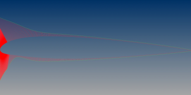
That’s actually not as horrendous as most conversions – it’s not awful, but that’s about the best thing I can say about it. Especially when you turn up the scaling on the back section of the airfoil, you can see it has some weird artifacts:
Again, the best thing I can say is, “it’s not horrible.” And, when you go to actually make things that attach to a wing lofted with this curve, you’re going to propagate those curvature wobbles into the resultant surfaces. Better to make a new airfoil from scratch. Trust me, any time you invest in creating nice smooth airfoils will pay off huge on the back end.
I want you to think of what the Platonic ideal airfoil would look like, especially in terms of it being smooth, and how the curvature graphs would look. This whole post revolves around two very simple tools – point editing/manipulating degree and point count, and the use of curvature graphs to analyze our work. So, imagine in your head what this ideal airfoil would look like, especially the curvature combs. They would peak at the leading edge, and then very smoothly fade out as you travel aft, right? The NACA 23012 is a little odd in that with that drooped nose, it ALMOST creates a flat spot on the bottom, about 15% in from the nose. You can see the curvature dips, rises, and then fades. So, in this case, we would want that feature to be there too of course, but we want our airfoil to be smoother, and ideally with as few points as possible. That ideal airfoil, in your head, should look like this, right?
Right? Nice and smooth, it peaks at the leading edge and then gradually fades. When I turn up the scaling on the back end, we get this:
See, we sill get the required curvature dip along the bottom surface, but everything is SMOOTH. Notice how nice and constant the curvature at the back of the airfoil is. This is what an airfoil is SUPPOSED to look like, right? We are now looking at something that is far closer to what the “real” airfoil is, are we not? This is not a copy of a copy. How close is it to the original data? I scaled this up to 60″ in chord length (in the ballpark for a GA plane) and was able to fit my curves to the original data to within 0.005″. What do my curves look like? There’s four of them – two top and two bottom. Here’s the top and bottom “main” curves, with the points turned on:
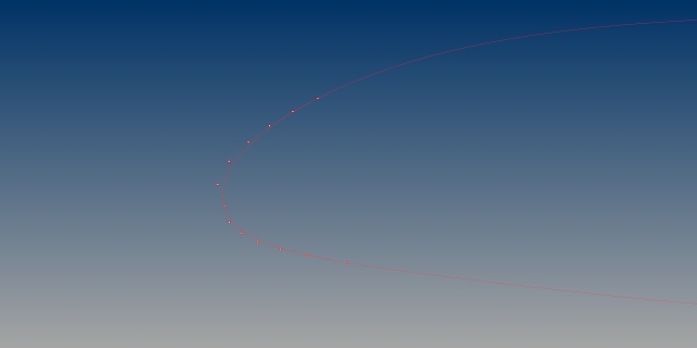
Each is a degree 5 curve with 9 points – so, NOT single span, but not so many that you cannot point edit the curve, or any surface created from the curve. Here are the nose curves, which have the break between them at the leading edge point:
How did I create these curves? I started with rebuilding the back sections, and point edited them to fit. There’s no magic here – notice there are more points where there is more curvature, and fewer points where there is less. So, place your points accordingly. Then, point edit to get them to fit your data. Add points if you need more control. Check your new curve against your original points, and always always always check with curvature combs. Seriously, just put a curvature comb up on your curve as you work on it, and leave it up till you’re done. Then, when you’re happy with the main top and bottom curves, create your nose pieces just by using whatever is clever – in this case I used BlendCrv, point editing, and curve matching tools. Again, keep asking yourself, “Is this what the curvature graph for an airfoil looks like?” Keep asking yourself that question until the answer is “yes.”
I’m always blown away in my work how many terribly drawn airfoils I see, because really when you get down to it, making proper airfoils doesn’t take fancy or expensive software. Really, it’s just rebuilding curves, point editing them, and constantly checking your curvature graphs. But, you can’t really sell that as a software package, so we get all sorts of “smoothing” plugins and automatic airfoil conversion plugins. Trust me, there is no purpose to those tools, they will only serve to make your life harder. Rebuild. Point Edit. Check your curvature. Done.
-Sky


