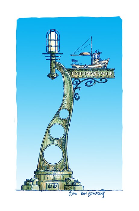
As I look at the signs for developments it makes me wonder why there aren’t more creative and fun ideas used. The sign industry is chock full of people who insist they are creative and yet most of the signs are far from it.
We take a far different tack as we design developments. Imagine of we could use creativity at every turn – literally. Why do trees signs have to be a boring rectangular flat piece of metal with some boring type stuck on them?
With the advent of modern software, high tech materials and CNC plasma cutters, lasers and routers this kind of sign is easier than ever to design and create.
We are currently working on a number of projects where we will be proposing some very different ideas. The first one, below, is from a project I designed about seven years ago. Sadly the project never went ahead for it would have been ground breaking. It was for a tourist development by the seaside. The street signs and direction signs were to have been very different.


