The inn signs are now in full production and looking good. In the next series of emails I’ll be taking you through the steps we took to create them. This will be a little different than most of my posts because Peter and I jointly worked on these files and he uses a slightly different path to production that I might. The thing with EnRoute is the the program is so powerful there are most often multiple ways to do a task. As we were designing and building with ourselves as a client we also changed things on the fly to make it better. We enjoyed even more freedom than we normally do plus all family members were weighing in along the way. It was even more collaborative than usual. We would show around the design and the person we showed it to would say ‘That’s cool but what would it look like if we did…’ As every member of our team is ver talented and has years of experienceThings changed a fair amount along the way.
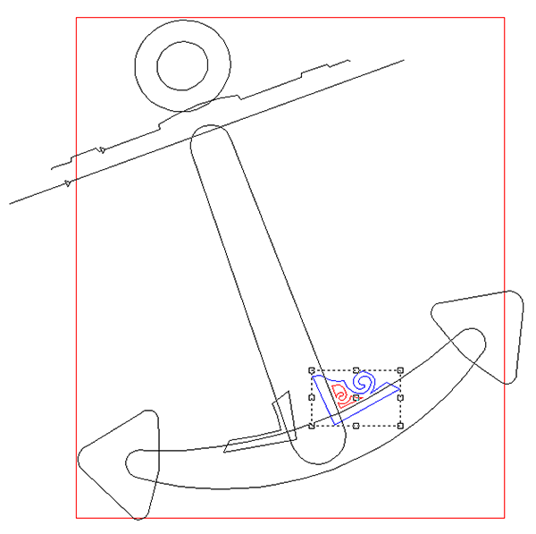
The first version of the design hit the mark but it looked a little static. Someone suggested rotating the anchor and this necessitated a change to the scroll. Then the design was deemed production ready.
Using that original trace drawing as a guide I did a cleaner version.
At this point Peter designed the fancy little plasma cut bracket we would insert into the cut Precision Board pieces. It is one more level of detail that would help take this sign over the top when we were done.
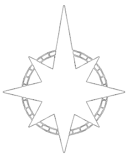
The compass star is an element that needs a little explanation. If you make a star shape and then use the bevel tool to create a relief you get a funny shaped bevel. The higher the bevel the more pronounced this shape becomes. The image on the right is that shape. To get a true compass star the points are build individually and then combined. This is the method we used.
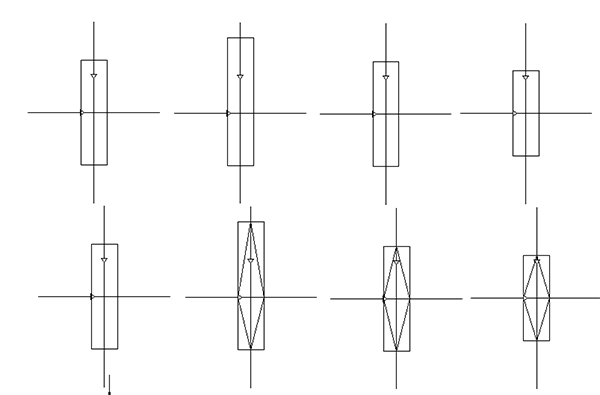
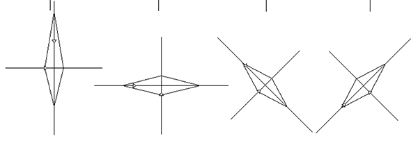
Because the star points are uneven in length lining them us is a little trick but as always there is an easy solution. The first step is too create a rectangle and then two lines through them. Make sure the lines are longer than the longest point. These are centered using the alignment centering tool. I then duplicated the rectangle and adjusted the length of the rectangles for each point. When I was done I again centered the lined in the rectangles.
I then selected the snap to intersection and drew out the compass points. When I was done I deleted the rectangles and grouped each star point with the intersecting lines.
The vectors were now complete and we were ready to begin building the reliefs.
First up was the compass star. Peter used the bevel tool to create the star segments. He then combined them to form one relief. As an added level of detail he added a custom texture bitmap to the centres of each segment.
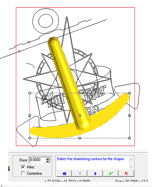
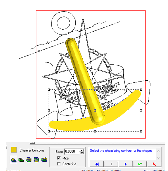
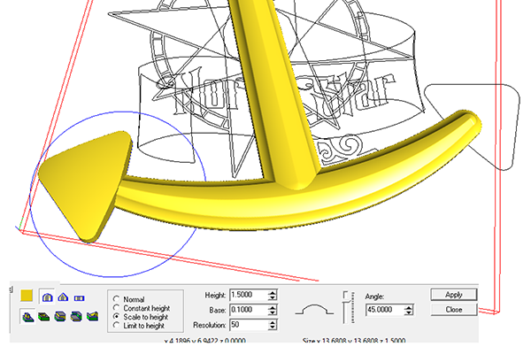
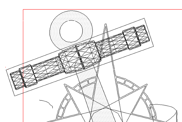
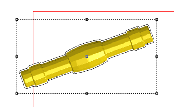
Peter opted to use the chamfer tool to modify the flat relief of the anchor bits. This created an interesting profile.


