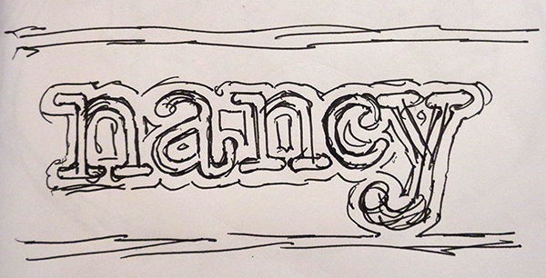
As always it started with a quick rough sketch.
I decided that some rivets in the corners would be cool.
To make the type look old I used the transform tool to add jitter to the lettering. Then I added a border.
I changed my mind once I took a second look and decided on washes with bolts instead in the corners.
Then it was done to work creating the reliefs starting with the base relief.
I then selected the inside border and the lettering border to modify the original relief by subtracting from it.
Then it was time for some subtle texture over the entire relief.
Then a second lecture bitmap was applied to just the sunken background.
Then I modified the relief by adding the washers and bolts as simple flat additions.
Lastly was the raised lettering using the dome tool.


