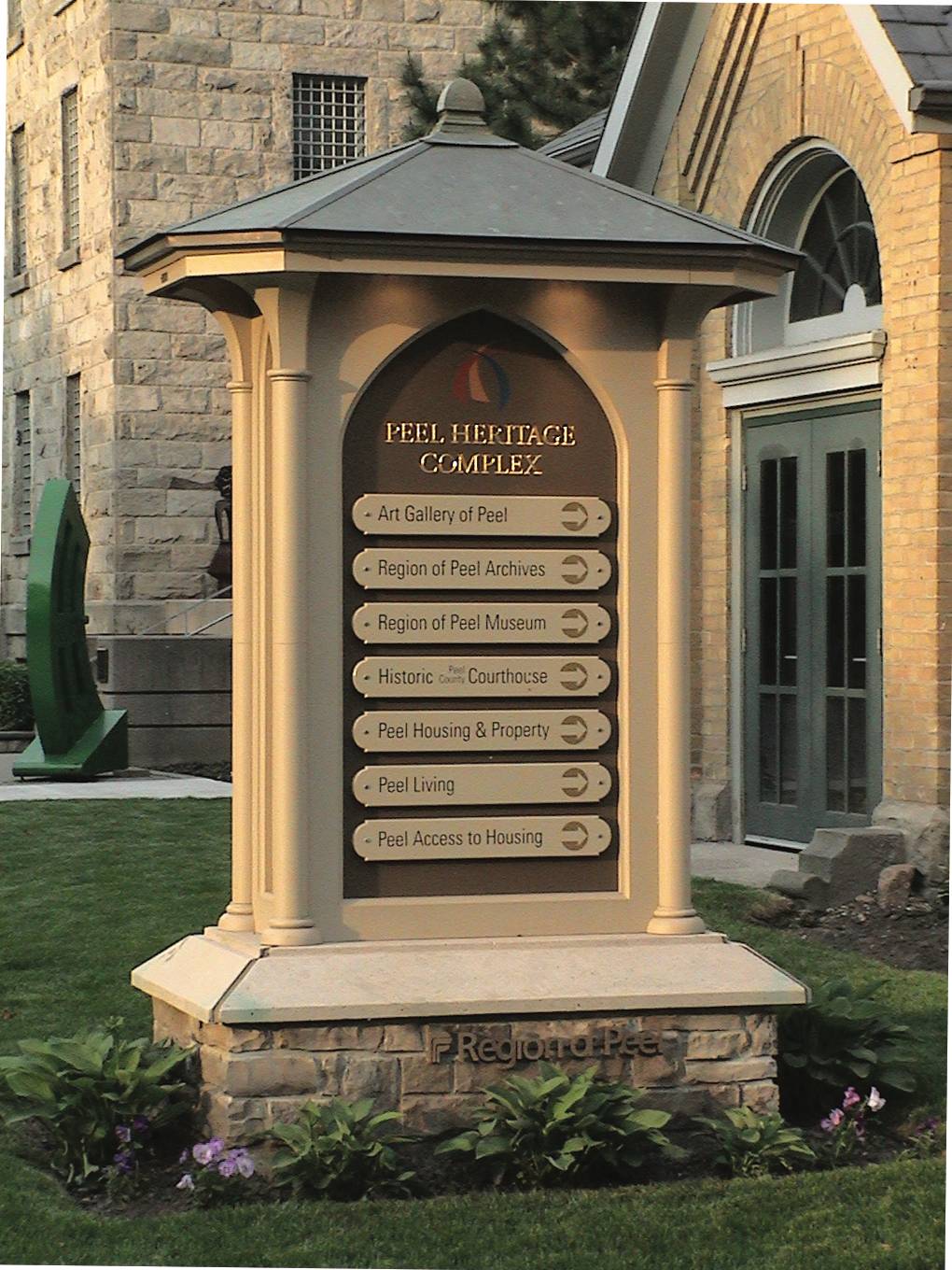
When Shane Durnford was asked to design and fabricate a handcrafted sign for the Peel Heritage Complex (now called The Peel Art Gallery, Museum and Archives) fifteen years ago in Brampton Ontario, he did his research. The sign was designed within the historical time period and form of the building’s architecture, resulting in a seamless and authentic design. Shane tells us how he used Precision Board HDU, a copper roof, Wiarton stone base and bronze and gilded lettering to create a brand new sign that looked like it had always been there.

When the Peel Heritage Complex owners needed some signs to compliment their historic site, they approached Shane Durnford. They were looking for three signs in total- a directional sign on the side 12 feet tall, a long sign on the lawn about 15 feet long and then some modern touches to the sign on the building itself.
Shane says, “I’m a sign specialist, as much as a sign maker. The visual fit and placement with surrounding environment greatly influence the effectiveness of the final product.” He adds, “I tell clients they are hiring me for my expertise as well as supplying the product.”
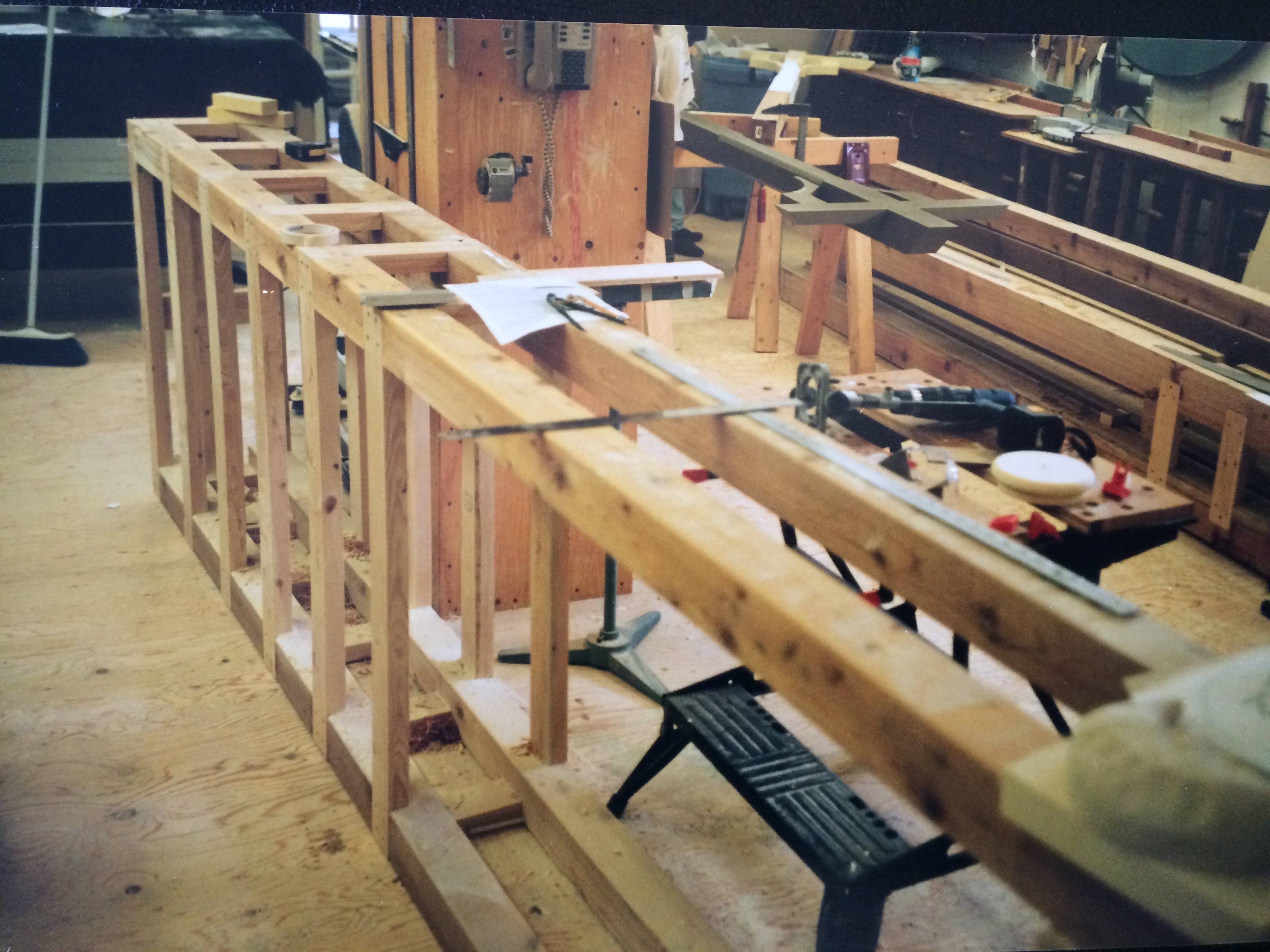
“I followed a design process that follows a criteria developed from research and discovery,” says Durnford. “I designed the bases and they were contracted out. The signs themselves were created in the studio and then assembled on location,” he adds.

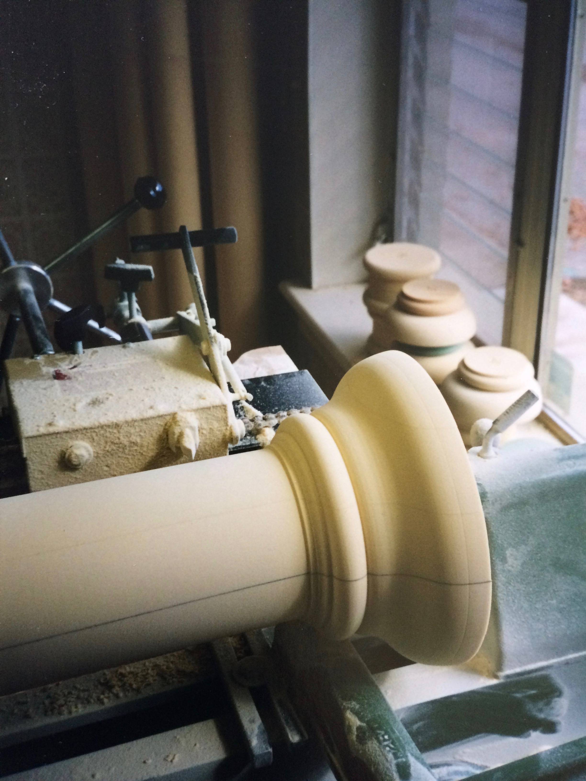
He sketched the designs, redrew them in Adobe Illustrator then scaled them to full size and hand-crafted them out of PBLT-18 Precision Board HDU using traditional woodworking tools including a wood lathe (for the corner pillars ), bandsaw, table saw, and carving tools. There were no CNC machines used. Everything was done by hand.
The base is limestone from the Niagara escarpment, a native stone that was traditionally used throughout Ontario in the 1800’s.
The roof is copper that was patina’d. Shane says copper was a natural choice for this. He then used pot lighting to light the sign up at night.
“The principal criteria was that the signs had to look like they had always been there,” he tells us. “We had to match the architecture, the building and historic vernacular.”

“They had a reader board originally, something very modern. It was a full disconnect from the historic setting and architecture, especially considering the site was a landmark in the area and they used it for period movies,” Shane says. “I researched the history and time period so I could get inside of the thinking behind the architectural forms and materials used. This was the framework for the sign designs.”
Shane says he loves the challenge of creating new signs that authentically blend with historic buildings and their stories.
“I look at everything- after all the research and information is gathered, I then tuck it away and go by feeling. It tends to design itself this way.”
Durnford says for projects like this, he’ll go back to the history of the building and research the time period and architecture.
“I want to understand why they did what they did and then that gets infused into your design. It’s creating a story. How it’s going to be used. It’s a nice blending of all of it, combined with the quality of materials used.”
Shane says too many signs these days are new interpretations of old pieces and they fall short- there’s no story. The very thing that gives it soul.
“Old buildings were intuitively designed using natural proportioning and patterns, You look at old buildings and you feel and connect on a visceral level,” he says. “You look at a new building and it’s usually void of these values, and connection.”
Shane says, “I feel signs are all about story telling and intimate communication. They can bridge a strong connection not only to the subject they represent but to ourselves as well. A making for a very effective branding and marketing tool.”
It took Durnford about two to three months to make all the pieces, including the structure it was on and getting all the copper applied. To assemble it took a couple of days.
When the Peel Heritage Complex was renamed to The Peel Art Gallery, Museum and Archives, Shane was asked to come back and retrofit the signs in 2012. You can see what they look like right now in the photos below.
Shane graduated from Toronto’s George Brown sign-writing program in 1981. With lettering quill in hand and a box of paint, he started from a humble shop in Creemore, Ontario and, within a few short years, had become a highly sought-after Sign crafter. As a Registered Graphic Designer, Shane quickly became known for not only his superb hand crafting skills but also for his novel image consulting and design services, across various mediums: logos, websites, promotional/advertising material, illustration, corporate branding, and showpiece signage. His unique brand is sensory storytelling thru maximum impact, multifaceted visual imagery.
Shane’s work and articles have appeared in international trade publications. National exposure in major Canadian magazines and television. His work, as well as articles, are well respected within the industry. He has hosted design workshops, participants from as far away as Australia. He is retained as key note speaker for branding strategies by municipalities. Shane Durnford Studios can be found on a variety of platforms, including his new Instagram account. For more information and other social platforms, check out his website. Design & Carving workshops are being organized for Summer 2018, more information to come. Email Shane to receive more info and pricing when it becomes available.
Coastal Enterprises offers free samples of Precision Board HDU. You can also sign up for our monthly blog roundup, which is jam-packed with helpful blogs on people like Shane doing creative and interesting things with Precision Board. You can also give us a call with your questions at 800-845-0745. We’d love to hear from you!