Sometimes, after I complete a design I just know I could have done better. There’s only one thing to do. DELETE.
Dan Sawatzky’s Blog
Phil’s Pholly
A while back I posted a how-to on the Treasure Quest sign. In the last installment the sign had been laminated over the framework. The rest of the twisted tree had been lathed and was ready for the concrete. Since then we sculpted the concrete ‘wood and bark’ and allowed the tee to cure before it was ready to drag back in the shop to finish up.
Piece of eight
Designing and building a theme park is a lot of fun, especially if you get to control all aspects of the design. The rides are being manufactured by a company in Italy but they allowed me to help with the design to help the ride fit into the theme of the park. Unless we want to spend a great deal of our customer’s money the changes are limited to cosmetic items alone.
2014 Sign Magic Workshop a success!
We had a high energy group assembled for our 2014 Sign Magic Workshop. Our guests were from all over including Nevis – Alberta, Newark – California, Hickory – North Carolina, Jackson – Wyoming, Prior Lake – Minnesota, Invermere – Roberts Creek – Vernon – British Columbia, and Aitkenvale – Australia. Jeff Hartman, one of the creators of EnRoute came from Denver – Colorado to help with the technical side of things. This eager group soaked up everything we shared, took tons of photos and notes and did up some pretty spectacular projects during the hands-on workshop time
Workshop name plates 2014 – Part eight
I covered the file creation of Philip’s name plate back on September 2. It looked great after it was routed from 30 lb Precision Board. The painting crew was ready to give it a cool paint job but I asked them to hold off for I had a little more detail in mind. They had already applied some FSC-88 WB primer (thick bodied water base primer) using a small brush to add some texturing to the lettering. Philip is attending both workshops and rather than make him two name plates I decided I would make him one that was a little more elaborate. Sarah mixed up some Abracadabra Sculpting Epoxy for me and I quickly sculpted some barnacles and a starfish that was slowly making it’s way down across the lettering.
Workshop name plates 2014 – Part seven
For Torey’s name plate I wanted it to look like boards fastened together. I toed out the letters, learned and sized them appropriately then whipped out the rectangles that would become boards. I wasn’t worried about sizes or spacing at this point. I then selected odd number boards and assigned them a height to create the reliefs.
Workshop name plates 2014 – Part six
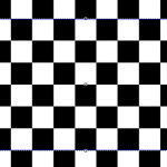
For Richard’s name plaque I wanted a dimensional waving checkered flag. There’s lots of ways to accomplish something like this in EnRoute but this is the easiest I can think of. It used the distort tool. I started with a bitmap from the TEXTURE MAGIC COLLECTION
Workshop nameplates 2014 – Part five
Jim’s nameplate was pretty straightforward save for one detail. I wanted the background texture to poke through the lettering border and into the lettering. I also wanted it to perfectly match what was around. Once again how and the order we do things in was the key. As always I started with the vectors
Workshop nameplates 2014 – Part four
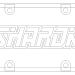
Each name plaque offers a unique challenge and is a great exercise to learn or review a tack in EnRoute. For some, like Sharon’s it meant doing things in a particular order. As always I started with the vectors I needed. To combine the riveted tabs with the rectangle, the quickest and easiest way was to remove the lettering and then use the jigsaw tool to create a new vector. I then deleted the original tabs and border.


